Indoor drought plant
It finally rained in the New York area this weekend for the first time in many weeks, after the driest October we’ve ever seen. Yet most New Yorkers are unaware of our water trends, because city-goers experience dry spells as a lack of the daily inconvenience of rain. We keep watering the plants in our apartments, and the landscaped plants outside get watered by other humans. Yet with Brooklyn’s brush fires and New Jersey’s full-on forest fires, and our low levels in our drinking water reservoirs, these climate swings affect our lives nonetheless.
I wanted to make a mechanical plant (that can only exist inside) that visualizes the precipitation outside: one that’s “watered” by the recent rainfall, bringing the context of our water trends into our inside lives. Making the physical plant would be a huge challenge, though. For an MVP, I made the drought digital with a tamagotchi plant in a state of aliveness corresponding to recent rainfall.
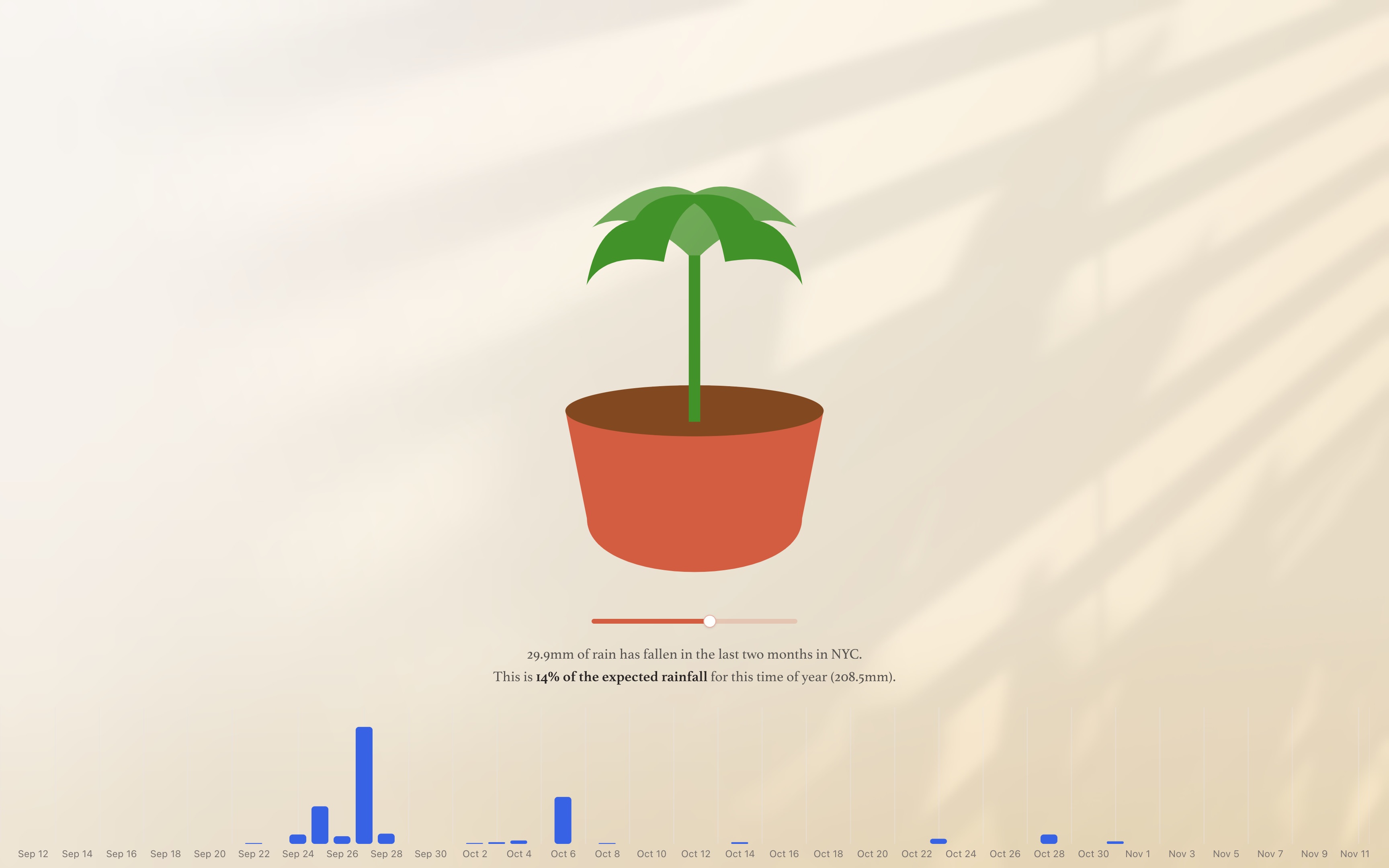
Open the site – view source code
Weather data
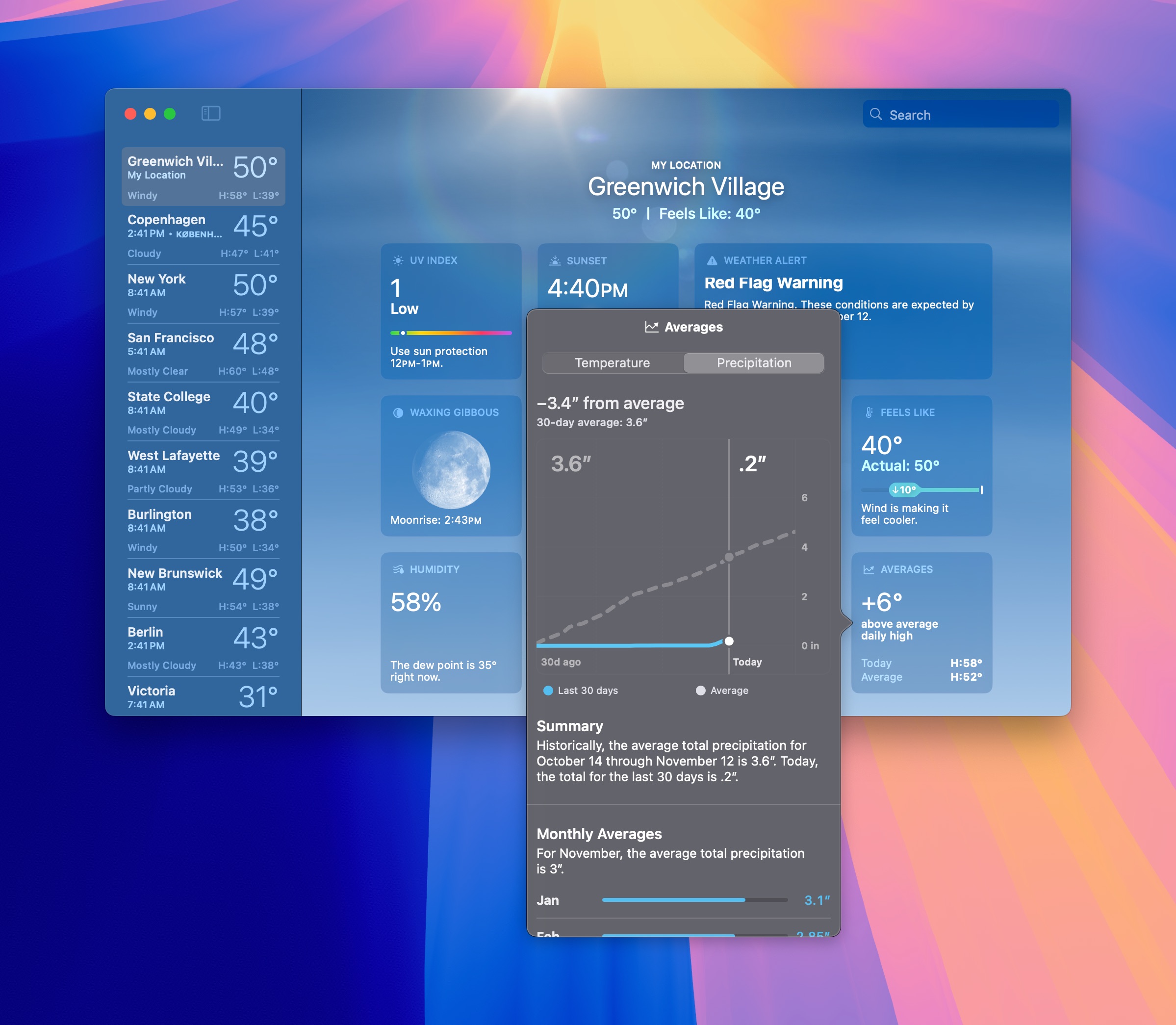
Data-wise, I was inspired by Apple Weather’s remarkable “Averages” widget, which is one of the best examples of climate-change-aware UI design in recent years. It doesn’t scream “climate feature,” but it subtly reminds tens or hundreds of millions of people who use Apple Weather that the weather exists in the context of all of which came before it.
I started this project by finding an API for historical weather data. I was looking for the last 60 days of precipitation totals, which I’d want to make a chart of. Ideally it’d show the expected amounts based on historical averages too. I found Open Meteo, a free and open source weather API that includes historical data, no API key required. Though its response formats are strange, it comes with a TypeScript package and example code that’s easy enough.
I set up a Next.js project with a Route Handler to get the historical precipitation, which I formatted like this (precip in mm):
[{dt: "2024-09-18T00:00:00.000Z", precip: 0},{dt: "2024-09-19T00:00:00.000Z", precip: 0},{dt: "2024-09-20T00:00:00.000Z", precip: 0},{dt: "2024-09-21T00:00:00.000Z", precip: 0},{dt: "2024-09-22T00:00:00.000Z", precip: 0},{dt: "2024-09-23T00:00:00.000Z", precip: 0.10},{dt: "2024-09-24T00:00:00.000Z", precip: 0},{dt: "2024-09-25T00:00:00.000Z", precip: 1.10},]
I pulled the monthly averages from rssWeather, which is not a strong data source since it’s just monthly averages, and I had to convert inches to centimeters.
Weather visualization
On the Next.js page, I pulled in the historical weather data plus the averages in a React Server Component, then got to work on the frontend. I’m using Incremental Static Regeneration each hour, so the page is static but refreshes itself consistently.
To visualize the precipitation, I originally had in mind a super-scrubbable timeline interaction like Rauno’s run log. Unfortunately the code for that project is not open source, and I couldn’t find any open source projects with a similar interaction. I’d still love to build this idea in the future, but it could easily be 12+ hours in itself. I love his sound design and iPad-inspired cursor morph effect built into that project.
In lieu of that, I reached for my typical React charting library, Recharts, styled by shadcn/ui. I was able to make a decent-looking bar chart of the precipitation pretty rapidly, tooltip and all.
Looking back at it, I should have pulled up the Apple Weather example before I made my chart, and copied theirs; it’s a much strong visualization of the historical average compared to the result than makes sense with the bar chart, where I bailed on visualizing the monthly averages.
Plant
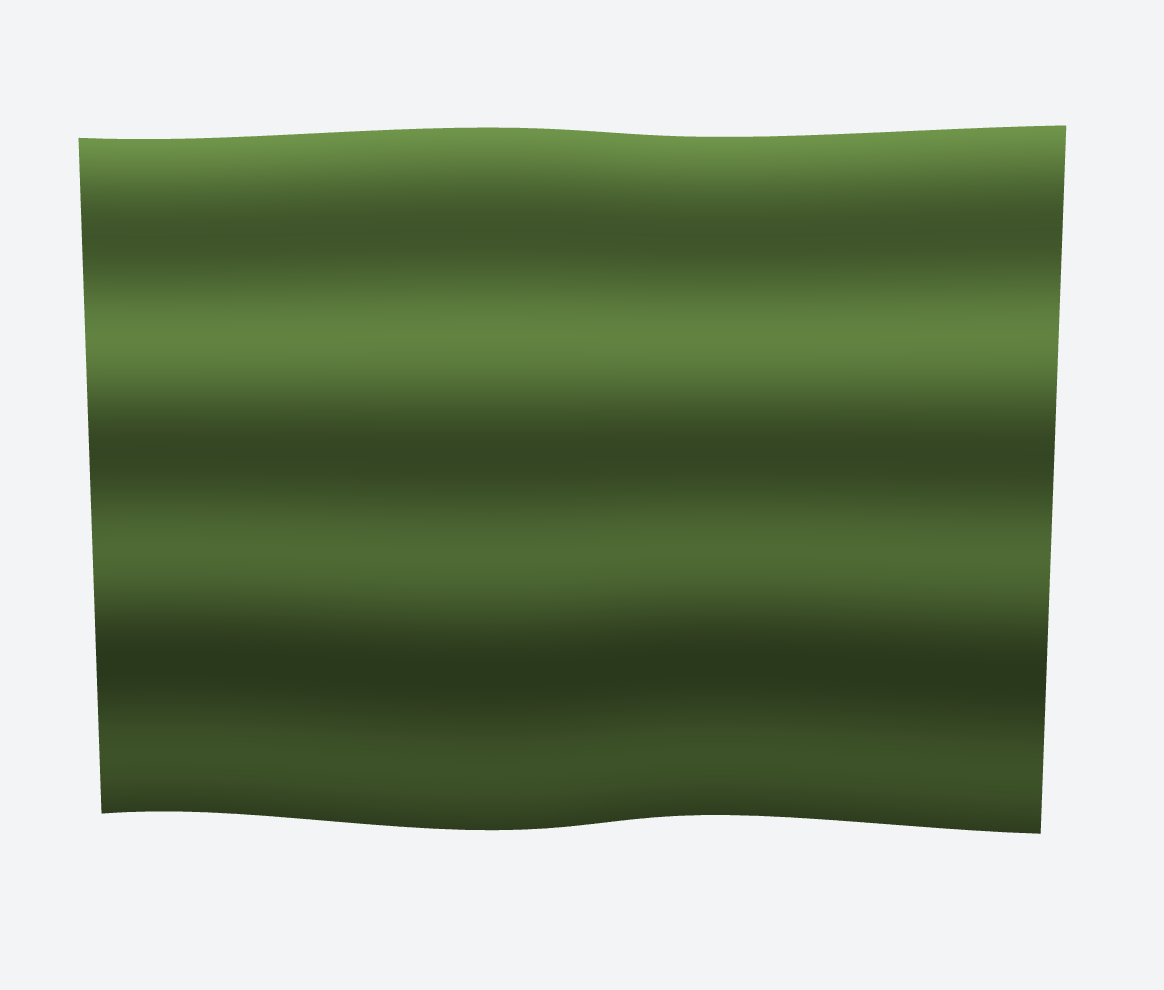
I tried many tools and attempts to draw the plant. I started by asking v0.dev to draw a 3D shader, which was giving major SOPHIE PRODUCT singles artwork energy. I learned a bunch about shaders trying to adapt those results though, and I’ve never used shaders in a project before. I might return to this concept of the plant as a surface that looks nearly plastic, as a WALL-E world type energy.
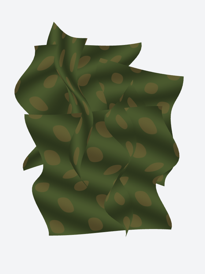
As I asked for more realism, v0 produced increasingly horrific creations. Its next pass created a 3D amalgamation of seaweed leaves intersecting one another. Its final creation of Monstera leaves look like oil spill-covered grim reaper leaves. Computers don’t know anything about plants, apparently.
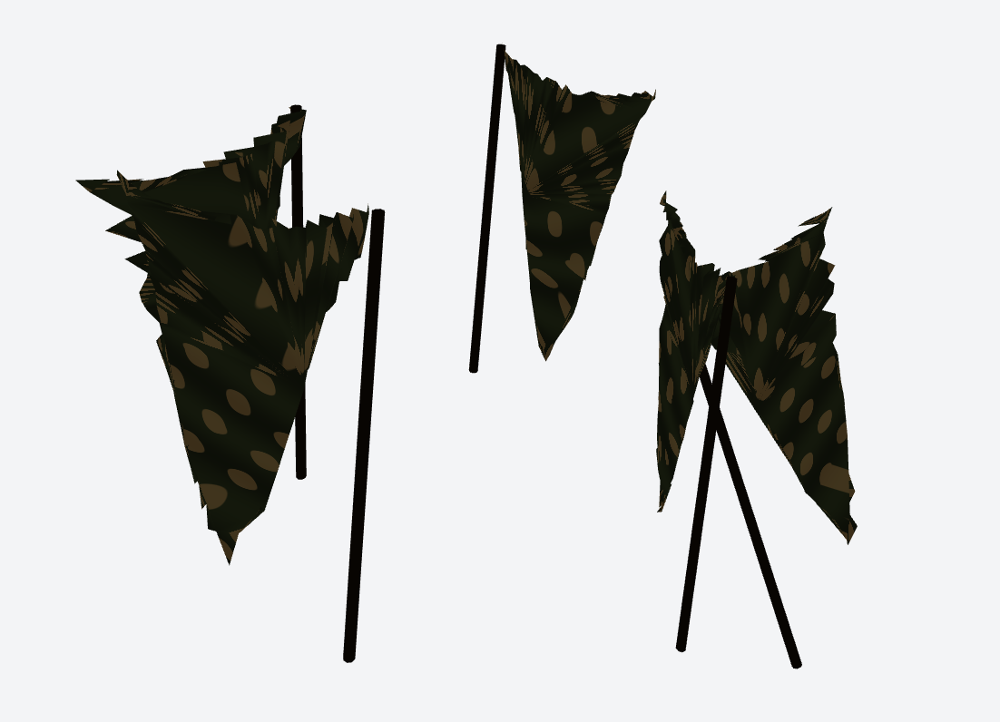
I read this tutorial on plant shaders and tried to import that into my project, but ran into technical issues with Next.js. Procedurally drawing plants is a whole field academically, apparently.
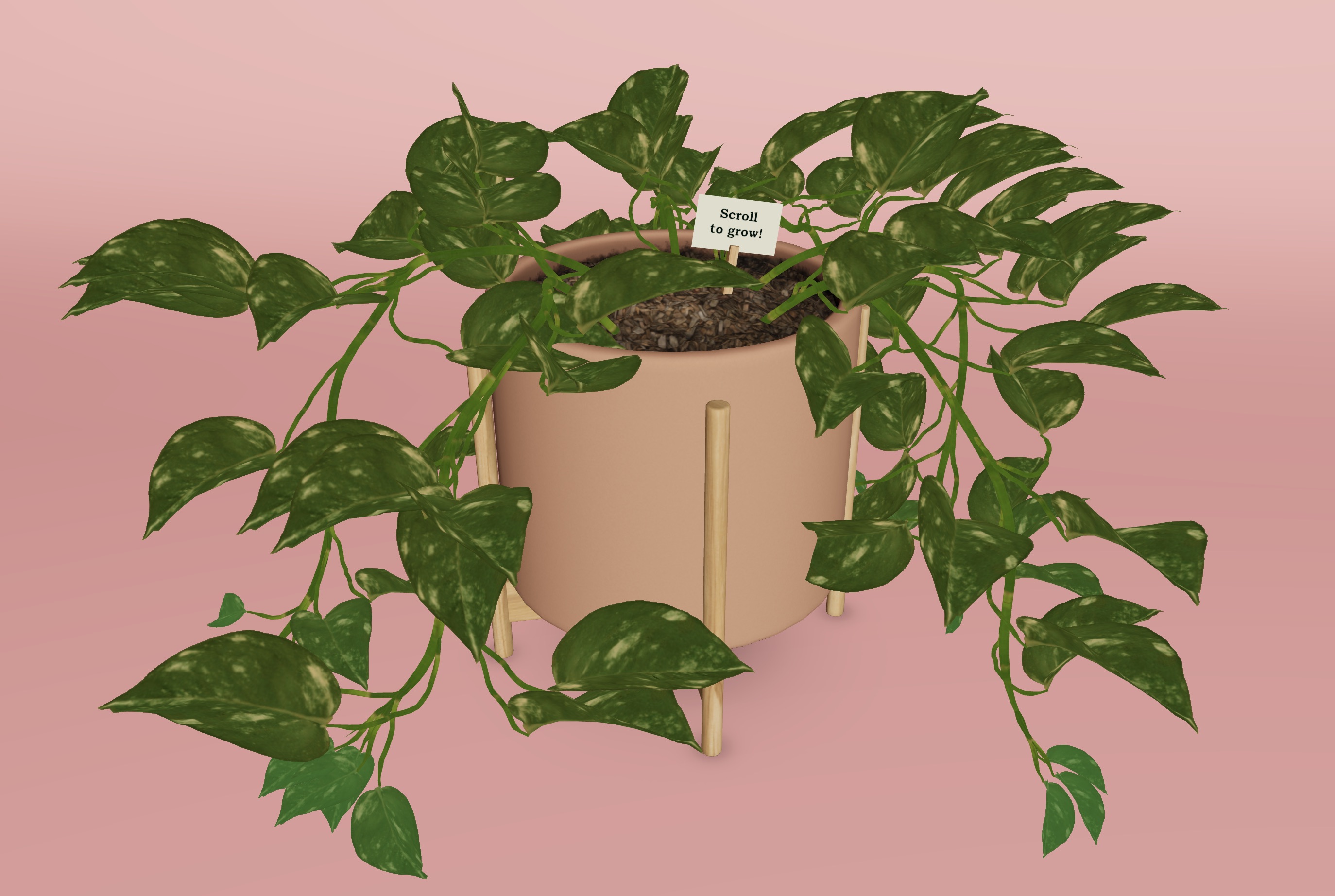
To get an MVP together, I used v0.dev to draw the plant with SVG. It’s a comically basic drawing of a Monstera plant, which transforms the project into more of a children’s toy vibe than either the tamagotchi housemate I was thinking or the SOPHIE energy. I pulled the SVG into Figma to redraw the pot, which was totally directionally messed up by v0.
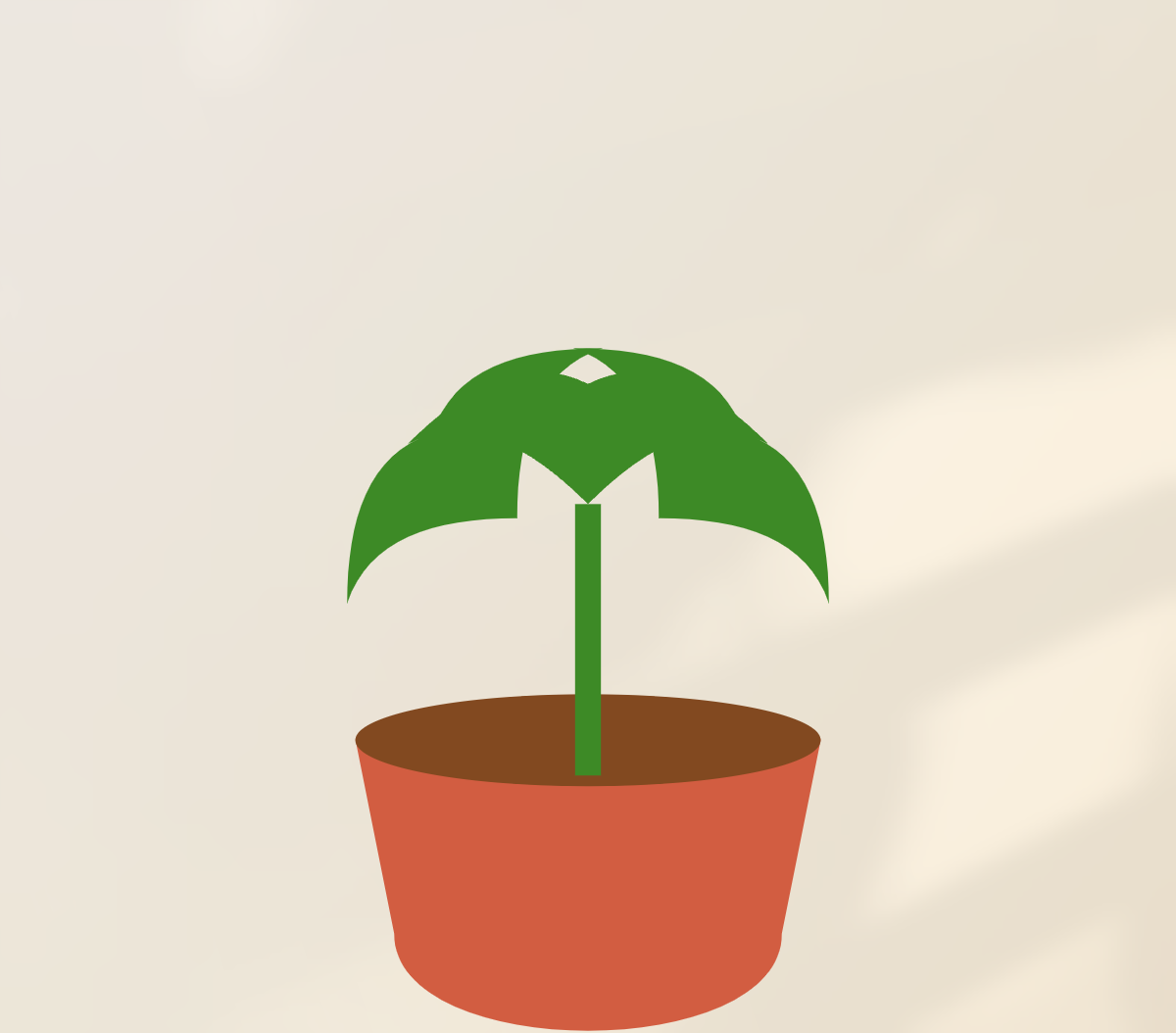
I added the shadcn slider to make it easy to see the full range of the plant, set initially to the percentage of the expected rainfall in the last two months that has fallen, with a quick text description of those numbers. Ideally, the slider would disappear & scrubbing the chart would animate the plant, but I didn’t get to that interaction in time.
Lighting
As a final touch, I just saw Jacky Zhao launch open source webpage sunlight, which is pure HTML + CSS + one image to recreate some of the effect Basement built into the Daylight website this May. I added it super quickly to the site, which added some much-needed naturalism to the page.