How Income Affects Health
About the Dataset
The National Health and Nutrition Examination Survey dataset – abbreviated NHANES – is a collection of data that follows individuals and tracks how different aspects of their health change overtime. This data is collected by the Center for Disease Control’s National Center for Health Statistics (2023), and the overall survey has been performed starting in the early 1960s, but the particular dataset we are analyzing contains data collected from 2009 to 2011. It collects demographic, socioeconomic, dietary, and health-related information from an attempted representative sample of Americans, across age groups, over-sampling persons 60 and older due to their significance in the U.S. population (CDC, 2023). The subset of NHANES that interested us the most was how (or if) economic factors, such as income, influence different health outcomes/behaviors.
Questions
- What is the distribution and mean income of the sampled population?
- Is there a significant difference in the blood pressure of people who make less than the mean income versus those who make the mean income or more?
- Is there a relationship between household income and participants’ number of children?
- Of the pregnant population, is age correlated to income levels? Do wealthier participants become pregnant earlier or later in life?
- Are physical activity days per week and income correlated?
Analyses
To perform our analyses, we begin by setting up common libraries in our Python coding environment, and downloading the NHANES dataset as a CSV from GitHub. Additionally, we are setting a custom font, Instrument Sans, which we downloaded from Google Fonts, for all the visualizations made throughout the report.
import pandas as pdimport numpy as npimport matplotlib.pyplot as pltimport seaborn as snsfrom scipy import statsfrom sklearn.neighbors import KernelDensityfrom matplotlib import font_managerfrom scipy.stats import f_onewayfrom scipy.stats import fnhanes = pd.read_csv("https://raw.githubusercontent.com/GTPB/PSLS20/master/data/NHANES.csv")# Describe HHIncomeMidprint(nhanes['HHIncomeMid'].describe())font_path = 'InstrumentSans.ttf'font_manager.fontManager.addfont(font_path)prop = font_manager.FontProperties(fname=font_path)plt.rcParams['font.family'] = 'sans-serif'plt.rcParams['font.sans-serif'] = prop.get_name()
Our questions all use household income as a lens on the specific health topic inquiries. This disqualifies participants who reported income only as “N/A” from our analyses. Before we begin our analysis, filtering these participants out removes 811 participants, or 8.11% of the 10,000 total, across all our analyses. Alongside each question, we will notate additional filters used on the participant dataset and the resulting population size.
data = nhanes["HHIncomeMid"].dropna()num_p = len(data)num_total_p = len(nhanes)print(f"Filtering for {num_p} of {num_total_p} participants, dropping {num_total_p - num_p} or {(((num_total_p - num_p) / num_total_p) * 100):.2f}%")# Filtering for 9189 of 10000 participants, dropping 811 or 8.11%
To discover the distribution and mean income of the sample population, we will calculate the mean income of the sample population, and visualize the income distribution. Overtop our visualization, we will estimate the probability density function of the income distribution with parametric and nonparametric models, and decide which is better fit for our evaluation.
# Calculate mean income of the sample population and chart itfiltered_nhanes = nhanes["HHIncomeMid"].dropna()df = filtered_nhanes.copy()num_p = len(df)num_total_p = len(nhanes)print(f"Filtering for {num_p} of {num_total_p} participants, dropping {num_total_p - num_p} or {(((num_total_p - num_p) / num_total_p) * 100):.2f}%")print(f"Mean of the median household income: {df.mean():.2f}")# Create a Kernel Density Estimator (KDE)kde = KernelDensity(bandwidth=10000, kernel='gaussian')kde.fit(df.to_numpy()[:, None])x = np.linspace(df.min(), df.max(), 1000)pdf_nonparametric = np.exp(kde.score_samples(x[:, None]))pdf_parametric = stats.norm.pdf(x, loc=df.mean(), scale=df.std())# Plot both approachesplt.hist(df, bins=30, density=True, alpha=0.7)plt.plot(x, pdf_parametric, 'g-', label='Parametric (Normal)')plt.plot(x, pdf_nonparametric, 'r-', label='Nonparametric (KDE)')# Format X axis with commas and $ prefixplt.gca().xaxis.set_major_formatter(plt.FuncFormatter(lambda x, loc: "${:,.0f}".format(x)))# Label axesplt.title("Distribution of Income")plt.xlabel("Median of Yearly Household Income")plt.ylabel("Number of Participants")plt.legend()plt.show()
This is the resulting histogram:

In this case, though the incomes below $80k make up a fairly normal distribution, the entire dataset does not. This is because all people with incomes over $100k were reported as one category, a group with twice the number of participants. With this in mind, we should use the nonparametric model. The mean of the participants’ reported household incomes is $57,206, but this number does not visualize the full income range due to the reporting of the $100k+ income bracket. The Social Security website published lower national averages in 2009 ($40,711.61), 2010 ($41,673.83), and 2011 ($42,979.61), which means both the selection and reporting of the household incomes in this dataset do not exactly track the national population.
For our first health metric examination, we want to understand blood pressure across population groups. Children typically have lower blood pressures than adults, so we will look at the population over the age of 20 to reduce variance. Some participants have blood pressures of zero recorded, which is medically impossible, so we will drop these values. Combined with the filter of having recorded household income, that means this analysis filters for about two-thirds of NHANES participants: 6,380 of 10,000 total, dropping 36.20%. The NHANES dataset includes 8 metrics about blood pressure – three readings split across systolic/diastolic measurements, then an average of each type’s three readings. We will only rely on the average columns, as we don’t posit the variance between the measurements has a meaningful correlation to income. To begin, we’ll chart the average distributions to get a sense of the measurements.
# Filter for participants with blood pressure readingsdf = nhanes.copy().dropna(subset=['BPSysAve', 'BPDiaAve', 'HHIncomeMid'])df = df[df['BPSysAve'] > 0]df = df[df['BPDiaAve'] > 0]df = df[df['Age'] >= 20]num_p = len(df)print(f"Filtering for {num_p} of {num_total_p} participants, dropping {num_total_p - num_p} or {(((num_total_p - num_p) / num_total_p) * 100):.2f}%")# Visualization of the BPSysAve/BPDiaAve metricsplt.figure(figsize=(12, 6))sns.histplot(df['BPDiaAve'], bins=30, kde=True, color='blue', label='Diastolic')sns.histplot(df['BPSysAve'], bins=30, kde=True, color='red', label='Systolic')plt.title('Distribution of Average Diastolic/Systolic Blood Pressures Among Adults')plt.xlabel('Blood Pressure (mmHg)')plt.ylabel('Frequency')plt.legend()plt.show()
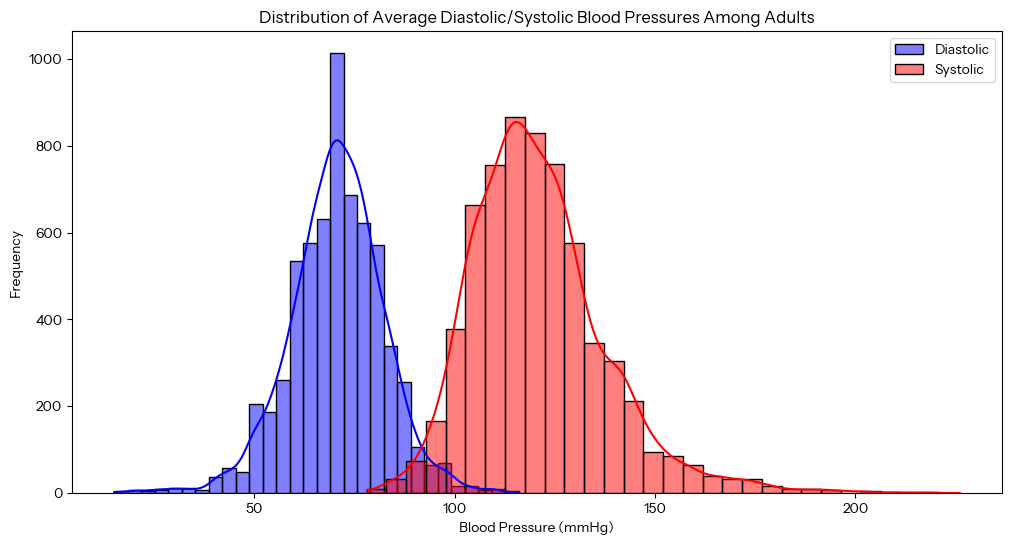
The distribution among diastolic versus systolic readings approximate normal. To simplify analyzing the blood pressure metrics, we can convert the two metrics into one, the Mean Arterial Pressure (MAP), a weighted average of the diastolic and systolic readings used in medicine that approximates overall blood flow. It’s calculated as:

We can add this calculation column to our dataset, then run correlations against income.
# Correlation with HHIncomeMid household incomecorrelation_matrix = df['BPSysAve'].corr(df['HHIncomeMid'])# Correlation between Systolic Blood Pressure and Household Income: -0.07517924correlation_matrix = df['BPDiaAve'].corr(df['HHIncomeMid'])# Correlation between Diastolic Blood Pressure and Household Income: 0.07327065df['AgeGroup'] = pd.cut(df['Age'], bins=range(0, 100, 10), right=False)df['MeanArterialPressure'] = df['BPDiaAve'] + ((df['BPSysAve'] - df['BPDiaAve']) / 3)correlation_matrix = df['MeanArterialPressure'].corr(df['HHIncomeMid'])# Correlation between Mean Arterial Pressure and Household Income: 0.01356237correlation_matrix = df['MeanArterialPressure'].corr(df[Age])# Correlation between Mean Arterial Pressure and Age: 0.1740176551852998
To visualize these metrics, a heatmap makes sense, which can group both age and income levels into bracketed groups, then visualize the correlation with MAP.
activity_by_income_age = df.pivot_table(index='HHIncomeMid',columns='AgeGroup',values='BPSysAve',aggfunc='mean',observed=False)plt.figure(figsize=(12, 8))sns.heatmap(activity_by_income_age, annot=True, fmt='.1f', cmap='rocket_r')plt.gca().invert_yaxis() # Invert y axis to have low income at bottomplt.gca().yaxis.set_major_formatter(plt.FuncFormatter(lambda x, loc: "${:,.0f}K".format((x * 10) - 5))) # Format y-axis labelsplt.xlabel('Age')plt.ylabel('Household Income')plt.title('Mean Arterial Pressure By Age & Income Brackets Among Adults')plt.show()
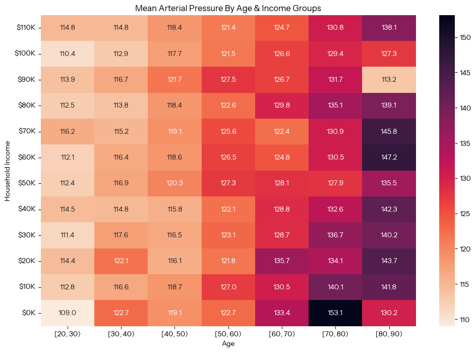
The heatmap visually reveals what the numbers suggested: there is a strong correlation between blood pressure and age, an order of magnitude stronger than any correlation between blood pressure and income level.
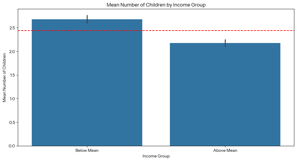
For our third question, we want to find the relationship between income and the number of children the participants have. Filtering for participants with household incomes and a number of children recorded (including zero) is 2,240 of 10,000 participants, dropping 7,760 or 77.60%. We can create both a bar graph and violin plot to visualize the relationship between these variables. The bar graph uses a binary scale (participants who make more and less than the mean income), and the violin plot zooms into a more specific scale (analyzing each income bracket).
# Filter out participants who are missing information on income and/or childrendf = nhanes.copy().dropna(subset=['HHIncomeMid', 'nBabies'])num_p = len(df)print(f"Filtering for {num_p} of {num_total_p} participants, dropping {num_total_p - num_p} or {(((num_total_p - num_p) / num_total_p) * 100):.2f}%")# Calculate the mean incomemean_income = df['HHIncomeMid'].mean()# Create a column evaluating whether income is below or above the calculated meandf['Income_Group'] = df['HHIncomeMid'].apply(lambda x: 'Below Mean'if x < mean_incomeelse 'Above Mean')# Group by income and calculate the mean number of children per groupchildren_by_income = df.groupby('Income_Group')['nBabies'].mean()print(children_by_income)# Visualization# Create a bar chart of number of children for above vs below mean incomeplt.figure(figsize=(12, 6))sns.barplot(x = 'Income_Group', y = 'nBabies', data = df)# Add line for mean childrenplt.axhline(y=df['nBabies'].mean(), color='r', linestyle='--', label='Mean Children')plt.xlabel('Income Group')plt.ylabel('Mean Number of Children')plt.title('Mean Number of Children by Income Group')plt.show()# Create a violin plot of number of children for every income bracketplt.figure(figsize=(12, 6))plt.gca().xaxis.set_major_formatter(plt.FuncFormatter(lambda x, loc: "${:,.0f}K".format(x * 10)))sns.violinplot(x=df['HHIncomeMid'], y=df['nBabies'], fill=False)# Force the y-axis to start at zero children, since lower values don't make senseplt.ylim(bottom=0)# Add line for mean childrenplt.axhline(y=df['nBabies'].mean(), color='r', linestyle='--', label='Mean Children')plt.title('Number of Children by Household Income Bracket')plt.xlabel('Household Income Bracket')plt.ylabel('Number of Children')plt.show()
This is the resulting bar graph, with the red line showing the mean number of children across the dataset:
This is the resulting violin plot, with the same red line. The white horizontal lines inside each violin allow comparing the mean number of children in each income bracket with the overall mean. Visually, these don’t show a strong correlation across the graph.
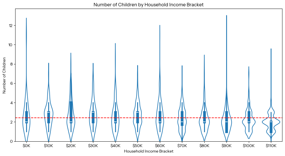
Since it’s not obvious from scanning the visualization, this is an appropriate question to develop a hypothesis test for, and we tested this hypothesis using an independent t-test. Our null hypothesis is that there is no significant relationship between the number of children someone has and whether that person’s income being above or below the mean, and our alternative hypothesis is that there is a significant relationship between the amount of children and someone’s income being above or below the mean. We judged whether or not the results were significant based on the p-value: if the p-value was greater than 0.05, we would fail to reject the null hypothesis. In other words, we used an alpha level of 0.05 for our statistical test.
# Independent T-Testprint("Is number of children correlated with income?")mean_income = df['HHIncomeMid'].mean()t_statistic, p_value = stats.ttest_ind(df[df['HHIncomeMid'] < mean_income]['nBabies'],df[df['HHIncomeMid'] >= mean_income]['nBabies'])print(f"T-Statistic: {t_statistic}")print(f"P-Value: {p_value}")# Creating a null hypothesis# Null Hypothesis: there is no correlation between someone's income and the number of children they have# Alternative Hypothesis: there is a significant difference in number of children across income groups# Significance Level: 0.05 (if p-value is above 0.05, we reject the alternative hypothesis)if p_value < 0.05:print("Reject H0")else:print("Fail to reject H0")# Degrees of Freedomdf = len(df[df['HHIncomeMid'] < mean_income]['nBabies']) +len(df[df['HHIncomeMid'] >= mean_income]['nBabies']) - 2print(f"Degrees of Freedom: {df}")
Of the 2,240 participants taken into consideration, the independent t-test resulted with the significant t(2,238) = 9.284, p< 0.05, suggesting that there is a statistically significant difference in the number of children based on someone’s income being above or below the mean, and that participants below the mean income (M<$57,206) tend to have more children than those who make the mean income or more (M>= $57,206). Our two choices of visualization paint different pictures: the bar graph shows a big picture idea of two income groups (how being above or below the mean household income and the number of children are correlated), whereas our violin plot adds granularity by income bracket. The violin plot is informative, but loses the big picture relationship found in the bar graph. Despite there being a strong correlation between mean household income and the amount of children someone has, we must remember that in statistics, correlation does not mean causation. The causes of this relationship are not clear from the data, and would require further research and questioning of the participants in the study.
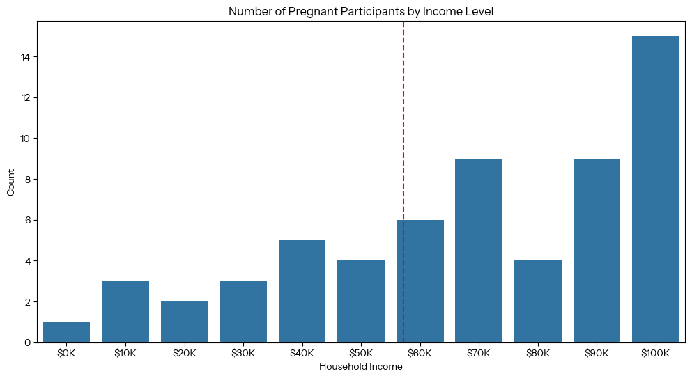
To answer our fourth question, we seek to understand how pregnancy and age are correlated with income levels. We can create two visualizations: one bar graph of the number of pregnant people by income level, and one box plot showing the distribution of age by income among pregnant people. Note that only 72 participants were pregnant while surveyed (0.72%).
pregnant_nhanes = nhanes[nhanes['PregnantNow'] == 'Yes']# Chart 1: Number of Pregnant Participants by Income Levelplt.figure(figsize=(12, 6))sns.countplot(data=pregnant_nhanes, x='HHIncomeMid')# Add a line along the x-axis for mean incomeplt.axvline(x=mean_income / 10000, color='r', linestyle='--', label='Mean Income') # Divide by 10000 to match x-axis scaleplt.title('Number of Pregnant Participants by Income Level')plt.gca().xaxis.set_major_formatter(plt.FuncFormatter(lambda x, loc: "${:,.0f}K".format(x * 10)))plt.xlabel('Household Income')plt.ylabel('Count')plt.show()
To visualize the distribution of age by income among pregnant participants, we grouped the “Pregnant Now” population by income, then created a box plot.
# Chart 2: Distribution of Age Among Pregnant Participants by Income Levelplt.figure(figsize=(12, 6))sns.boxplot(data=pregnant_nhanes, x="HHIncomeMid", y="Age")plt.title('Distribution of Age By Income Among Pregnant Participants')plt.xlabel('Household Income')# Add a line along the x-axis for mean incomeplt.axvline(x=mean_income / 10000, color='r', linestyle='--', label='Mean Income') # Divide by 10000 to match x-axis scaleplt.gca().xaxis.set_major_formatter(plt.FuncFormatter(lambda x, loc: "${:,.0f}K".format(x * 10)))plt.ylabel('Age')plt.show()
This is the resulting box plot:
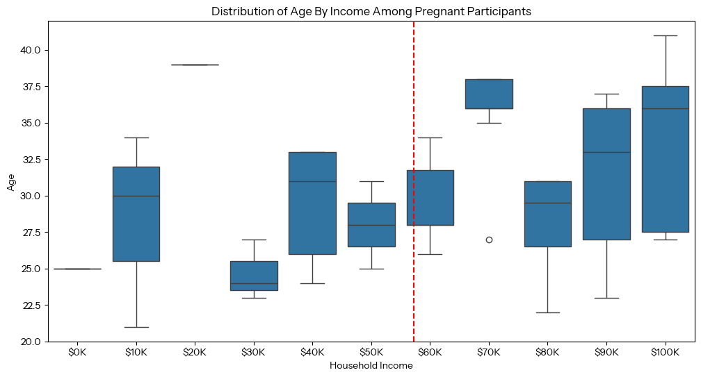
Based on the resulting graphs, it seems that more wealthy people (people whose household income is above the mean) were pregnant at the time of participating in the survey in comparison to those who make below the mean income ($57,206). Additionally, the box plot reveals that, of the people pregnant at the time of the survey, those who made above the mean income tended to be pregnant at an older age than those who were below the mean income, and the wealthiest participants had the largest age range while pregnant. This could be because people who have more money tend to focus on developing their careers and gaining greater wealth before having children, therefore people on the wealthier side of the mean income distribution tend to get pregnant at an older age.
To answer our final question of whether the frequency of exercise correlates with participants’ income levels, we can create another heatmap visualization, visualizing three variables: household income, age range, and days per week of physical activity. To prepare the data, we created a pivot table across decade-long age ranges with $10K income ranges and average days of physical activity per week. 4,311 of 10,000 participants, or 56.89% of participants, recorded physical activity days.
# Filter out missing valuesdf = nhanes.dropna(subset=['HHIncomeMid', 'PhysActiveDays'])num_p = len(df)print(f"Filtering for {num_p} of {num_total_p} participants, dropping {num_total_p - num_p} or {(((num_total_p - num_p) / num_total_p) * 100):.2f}%")# Calculate the mean incomemean_income = df['HHIncomeMid'].mean()mean_days = df['PhysActiveDays'].mean()# Select only numerical values for correlation calculationnumerical_features = df.select_dtypes(include=[np.number])# Calculating the correlationcorrelation = df['PhysActiveDays'].corr(df['HHIncomeMid'])print(f"Correlation Between Amount of Physical Activity per Days and Household Income: {correlation}")# Create pivot tabledf['AgeGroup'] = pd.cut(df['Age'], bins=range(0, 100, 10), right=False)activity_by_income_age = df.pivot_table(index='HHIncomeMid',columns='AgeGroup',values='PhysActiveDays',aggfunc='mean',observed=False)# Generate heatmapplt.figure(figsize=(12, 8))sns.heatmap(activity_by_income_age, annot=True, fmt='.1f', cmap='rocket_r')plt.gca().invert_yaxis() # Invert y axis to have low income at bottom and high income at topplt.gca().yaxis.set_major_formatter(plt.FuncFormatter(lambda x, loc: "${:,.0f}K".format((x * 10) - 5))) # Format y-axis labelsplt.title('Average Physical Activity Days by Income and Age')plt.xlabel('Age')plt.ylabel('Household Income')plt.show()
This is the resulting heatmap:
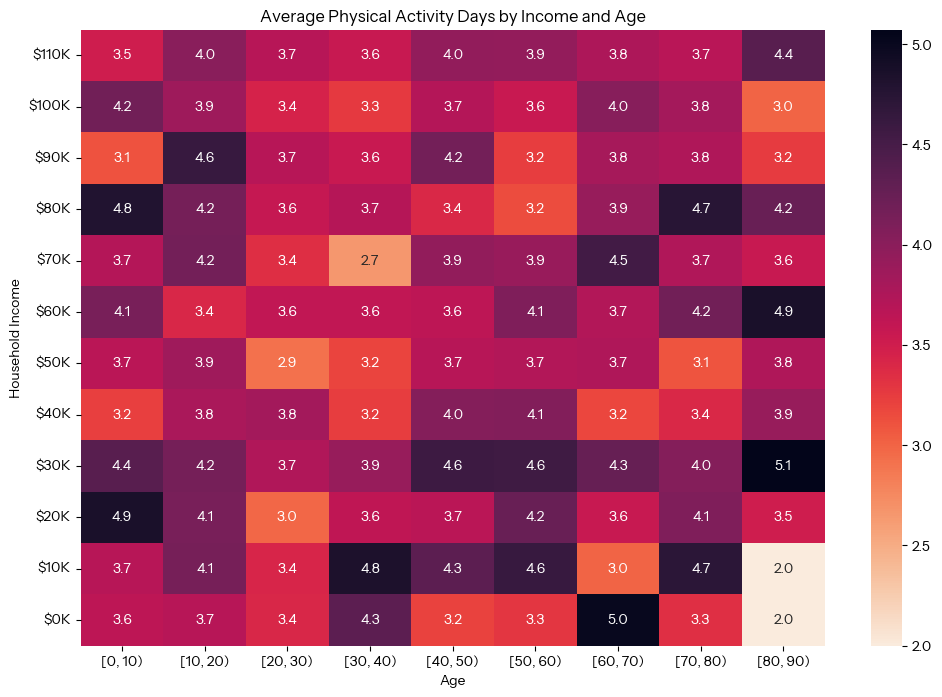
The heatmap does not reveal a clear relationship across mean household income, age group, and amount of days of exercise per week. Physical activity, after all, is more a lifestyle choice than a health outcome like other metrics this analysis investigated. Exercise is a very case-by-case basis, and is hard to generalize across a general population. Similar to other charts in this report, it is confusing that a “$110k” income category is charted, since the highest value in the dataset caps at $100k for household income.
Conclusion
In summary, our main findings were the following:
- The mean of reported median household incomes (not accounting for those who make more than $100,000) of the sample population is $57,206.
- There is not a strong correlation between blood pressure and income level, but instead we found a much stronger correlation between blood pressure and age.
- Through an independent t-test we proved that people who make below the mean income tend to have fewer children than those who make the mean income or greater.
- People who were pregnant at the time of survey skewed wealthier, and those who made above the mean income tended to be pregnant at older ages.
- There is no clear relationship between physically active days per week and being above/below the mean income, or the age of the participant.
Despite the valuable data contained in the National Health and Nutrition Examination Survey, we found some shortcomings that prevent the dataset from accomplishing its goal of accurately representing the American population. Though 10,000 is a reasonably large sample size overall, many fields are left incomplete; it is unclear if these were due to failures in surveying or participants declining to answer certain questions. Filtering for participants who answered specific questions (dropping “N/A” responses) reduced the population to a size that could be unrepresentative. This was especially a concern for the sample size of 72 participants who were pregnant at the time of survey. The dataset is also dated in terms of population demographics. Only binary gender categories (male/female) and three sexual orientation options (homosexual, straight, bisexual) are listed, and a limited number of LGBTQ+ people were surveyed, a significant American demographic. Additionally, by grouping all households with incomes over $100k together, the dataset lacks nuance among the wealthiest participants, and skews the mean. With the $100k+ income group, we ran into a technical issue neither Carina nor we understood, where graphs in questions 2, 3, and 5 showed a $110k income group not found in the source data.
Group Contributions
The research questions we developed were a 50/50 effort, with the same amount of contribution from both of us. Lachlan mainly focused on coding and the data visualizations, leading questions 1, 2, and 5 with ideas and input of what statistical concepts to consider in the code from Valentina. Valentina worked on questions 3 and 4, including contributing the null/alternative hypothesis testing, and led the writing of this report. All in all, the project was greatly collaborative with equal contributions and dedication from both of us. Google Gemini LLM-powered code autocomplete in Google CoLab was used consistently throughout the project, with Gemini providing technical help in filtering/manipulating data and using the visualization library APIs. No parts of the report were written with LLMs.
Sources
Center for Disease Control and Prevention. (2023, May 31). Nhanes - about the National Health
and Nutrition Examination Survey. Center for Disease Control and Prevention.
https://www.cdc.gov/nchs/nhanes/about_nhanes.htm
Social Security. (n.d.). National Average Wage Index. Social Security.
https://www.ssa.gov/oact/cola/AWI.html