Remapping our landscapes
I love maps. I’ve spent uncountable hours exploring the world on Apple Maps; I rely on apps like Citymapper to get everywhere I need to go; maps underpin a myriad of apps I rely on like Airbnb, Lyft, bike share, weather, package tracking, photos. Paired with GPS, our digital maps are one of humanity’s best-ever creations.
Western maps attempt to render the world as it is. In any map area, the scene seems to answer the question “what’s here?” with a complete inventory of roads, businesses, points of interest. But they answer that question with a specific lens—one of capitalism accessible to the modern consumer—and leave out information critical to understanding public health, how the world works, and the area’s history.
A few weeks ago I realized our digital maps show you places you can either spend money at or drive your car to; preferably both. Once you leave those qualifiers, the specificity and quantity of data rapidly dwindles, if the locations are even marked on the map.
These maps cost gigantic sums to maintain, and for companies like Google, they are not altruistic endeavors—they’re massive businesses. Google Maps is incentivized to show you places to drive to and spend money at because it is paid by businesses to show their pins more prominently. In addition, they license their map’s data for large sums to companies like Uber, Lyft, Airbnb, and Zillow, which use the data for their own (profitable) services built around maps.
For driving around to places to spend money, Google & Apple Maps are excellent products. They rapidly calculate correct directions, satellite imagery, helpful business information, and everything else we’re used to. This is no small accomplishment.
But their scenes are incomplete. Maps omit all the structures affecting public health, environmental disasters, and the hyperobjects/megastructures other than highways which will outlast us. A few of those features:
- Landfills, including abandoned dumpsites
- Fossil fuel extraction sites (coal mining, oil drilling, fracking)
- Fossil fuel pipelines (and their infrastructure like compressor stations)
- Incinerators
- Superfund sites (federal government-operated environmental disaster sites)
- Hazardous waste sites
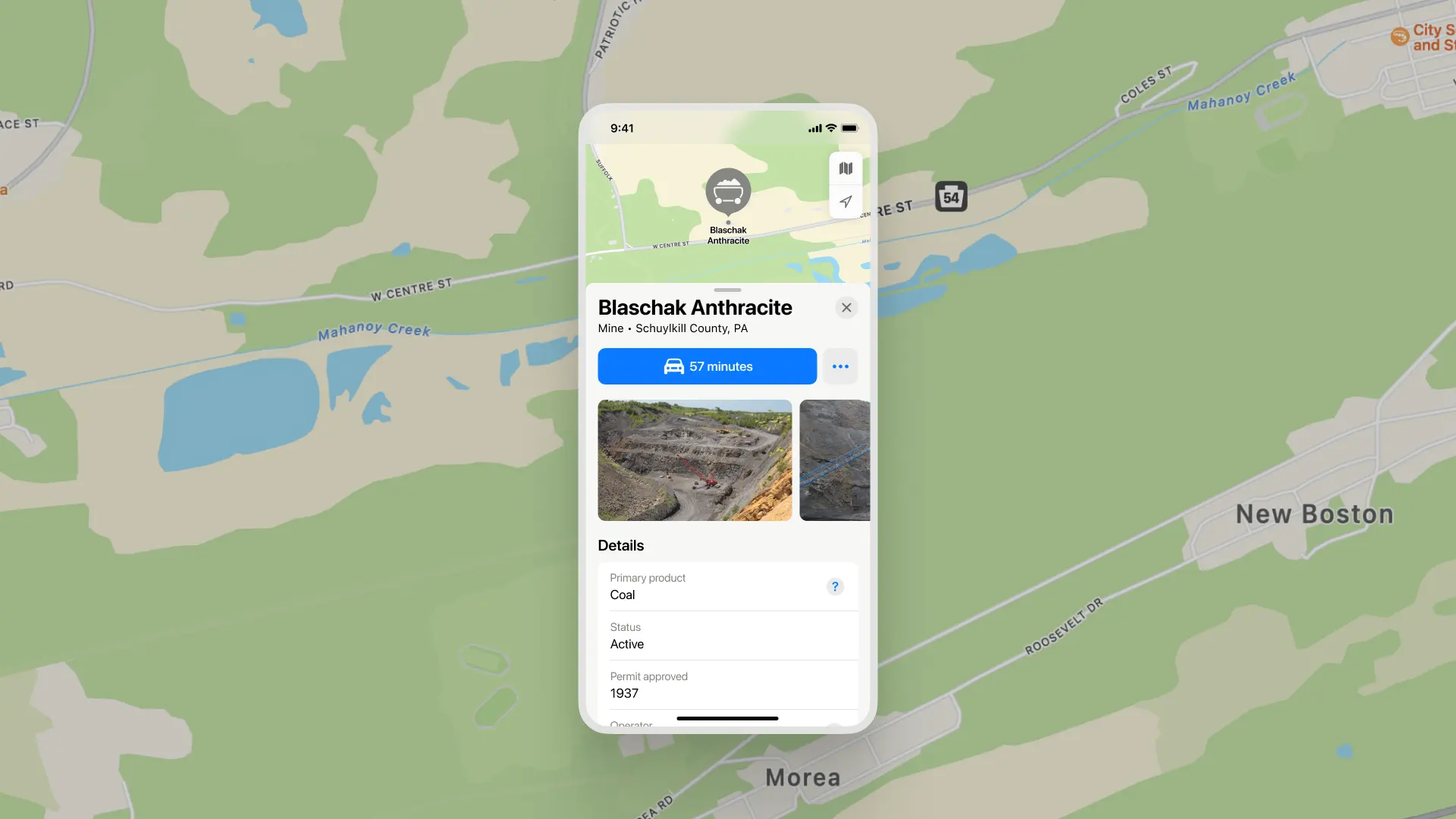
- Mines
Even as an environmentalist, I realized I couldn’t answer basic questions about my hometown in central Pennsylvania: Are there power plants in it? Where are the landfills? How far away is Pennsylvania’s infamous fracking? This is basic information about our cities we should know about where we live—but finding the answers is so hard, it’s unsurprising we don’t. By not having the answers to these questions accessible in the place we go to to see & understand what’s around us, our maps prevent us from thinking of these questions in the first place.
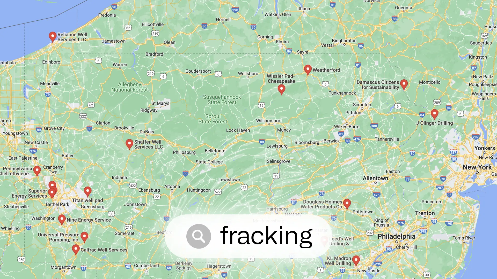
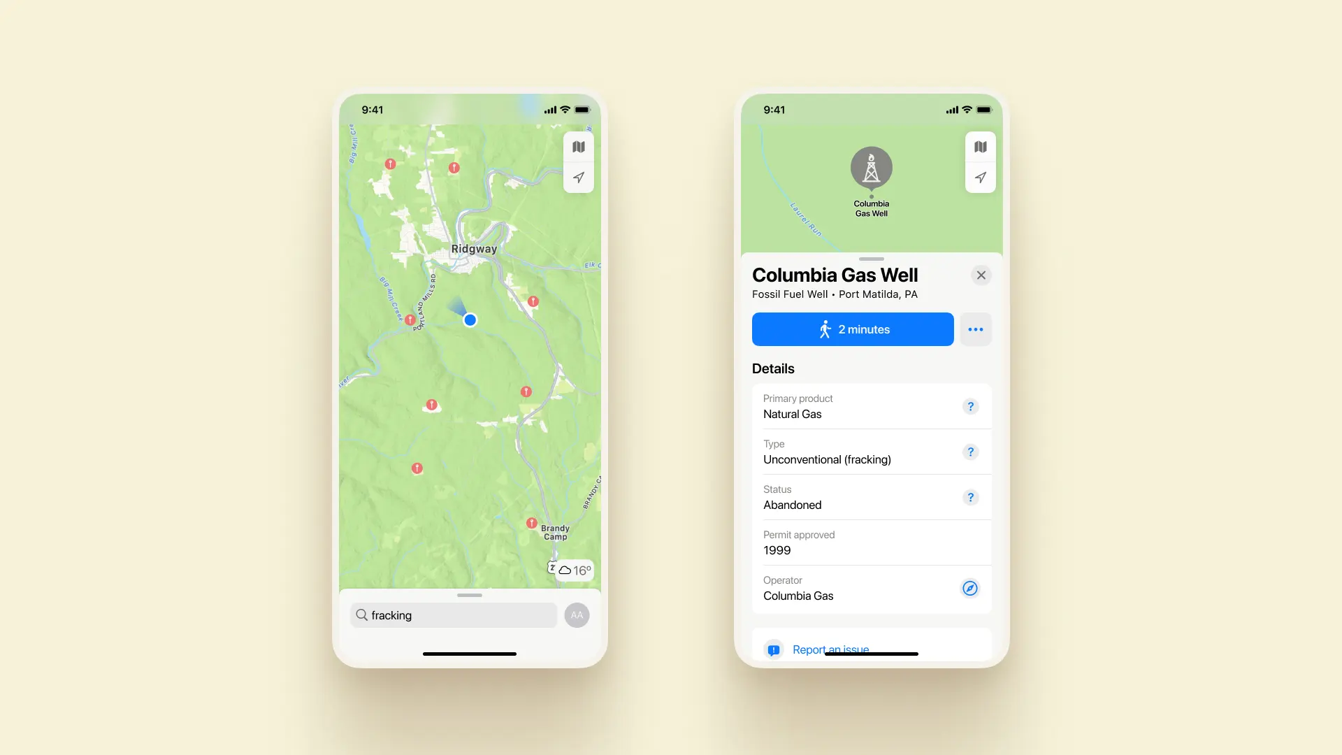
So how far away is the nearest fracking? On Google Maps, the search “fracking” in all Pennsylvania reveals regionally-headquartered energy companies. There’s one single point labeling itself as a wellhead.
On Apple Maps, the search reveals two towns not even in Pennsylvania called “Franklin.” That’s all.
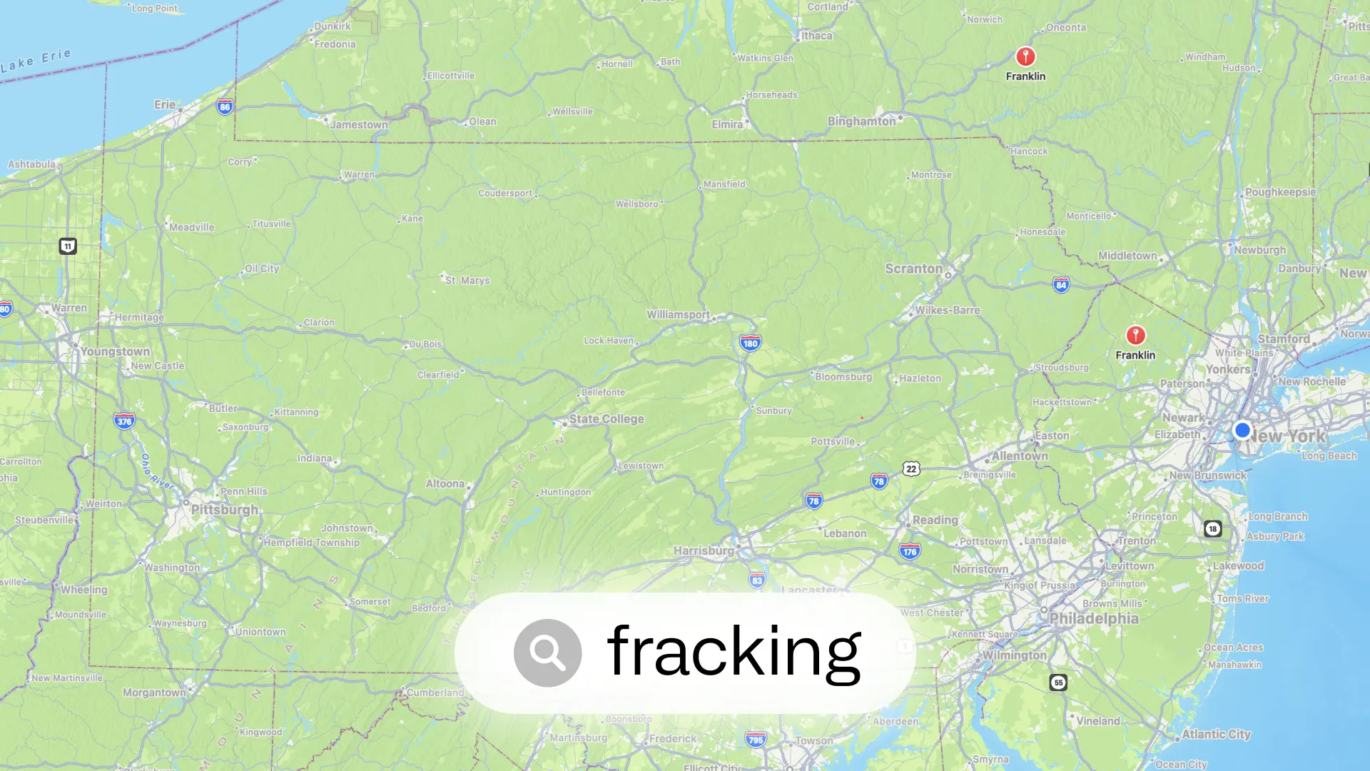
Neither of these are true, or acceptable, answers to this question. There are over 13,000 unconventional wells in the state. Active fracking is a mere 15 miles from my childhood home.
If you want to find that out, the Pennsylvania Department of Health has made a map to track “environmental indicators.” After lengthy loading time1, you can reveal layers for a variety of environmental hazards. This map is limited to Pennsylvania; other states have their own versions with their own names, using different technical platforms, with types of hazards often spread out between many maps with no unifying one.2
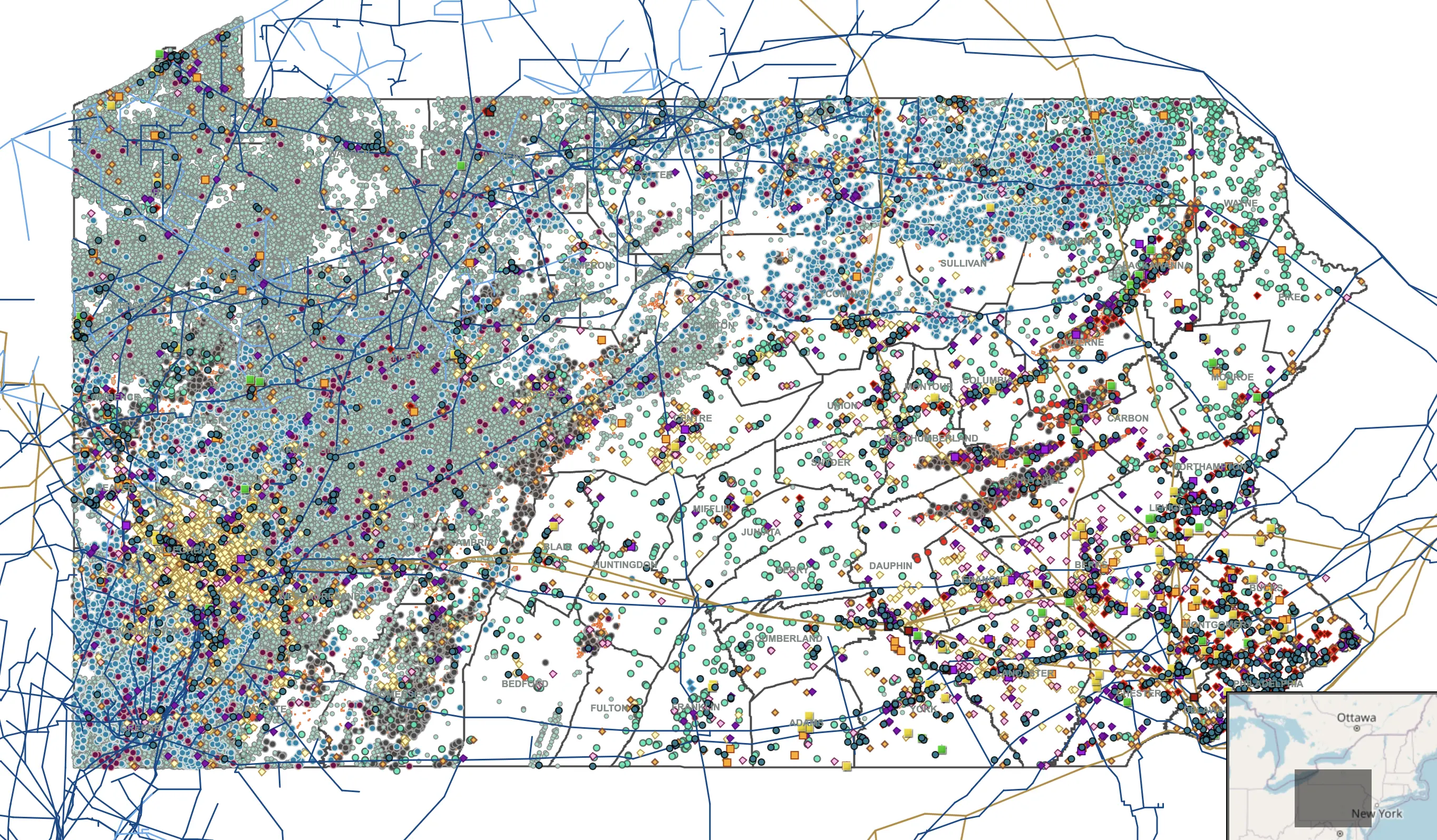
In my county’s area: the aqua dots are oil/gas wells, the darker blue dots are fracking. The crisscrossing lines are oil & gas pipelines. The orange areas are mining waste/drainage. The yellow spots are hazardous waste facilities (which include e.g. regulated university science labs & hospitals, plus unmanaged/abandoned waste sites).
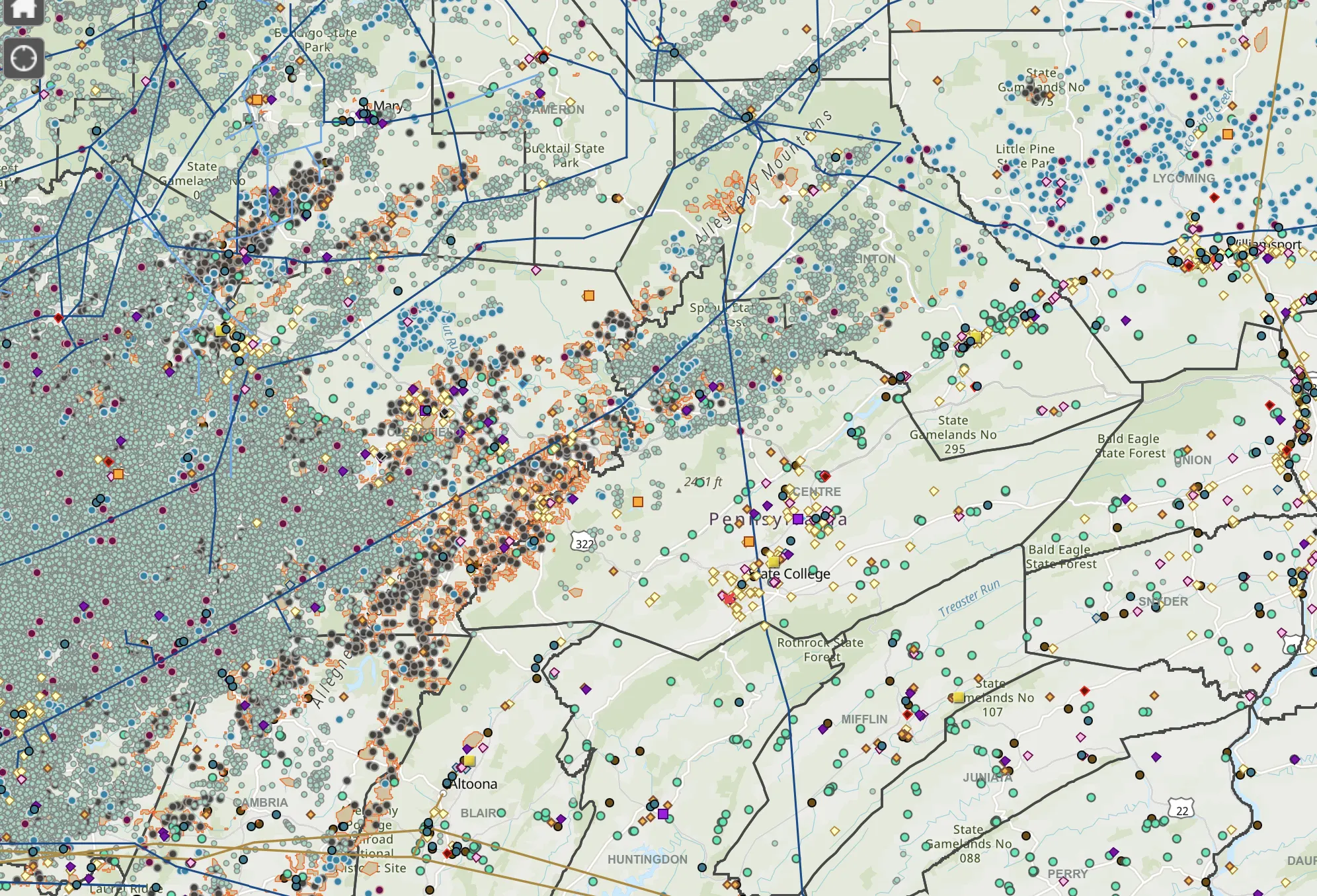
After finding a hazard on this map, the next step is figuring out if it poses a risk to you/its community. While the map has thorough numbers on pollutant levels at various sites, there is no visualization or information on what levels are safe, or how significant any data point is; there is no editorial indication. If you don’t know what a gas compressor station is—much less if a compressor station’s xylene levels in tons/year pose a risk—you’re on your own.
The EPA makes a separate website, to search “Enforcement and Compliance Data,” to find sites with documented violations of pollution standards. After confronting a search page with no fewer than fifty filters and inputs, you’re presented with a map of sites with failing grades. There are thorough reports of each site, but spending 15 minutes there with my level of knowledge, I was unable to determine the hazards any site I looked at posed or why. This is a tool for EPA officers, not the general public.
Looking at the information panels for most power plants in Pennsylvania on Apple or Google Maps—massive industrial sites employing thousands, visible for dozens of miles around—many don’t have an owner, phone number, or website listed, much less if they’re violating Clean Air Act policies.
We deserve to know what’s around us, in an accessible place and format. I don’t believe Google Maps should open to the same view as the Pennsylvania Environmental Indicators map—that’s not the information most people are looking for most of the time. But if you are, you should be able to find it. Industrial sites change the fabric of the surrounding community far more than many tiny businesses we demarcate with greater clarity and attention on our maps.
What if when you searched “fracking” in your area, you could see where it is? When you tapped a well, you could see who owns it, and what kind it is?
It shouldn’t be limited to fracking, or even fossil fuels. There’s simple pieces of information about nearly any industrial site our maps should have: what type is it? How long has it been here? Who owns it? How big is it? This applies to landfills, to solar power plants, to mines.
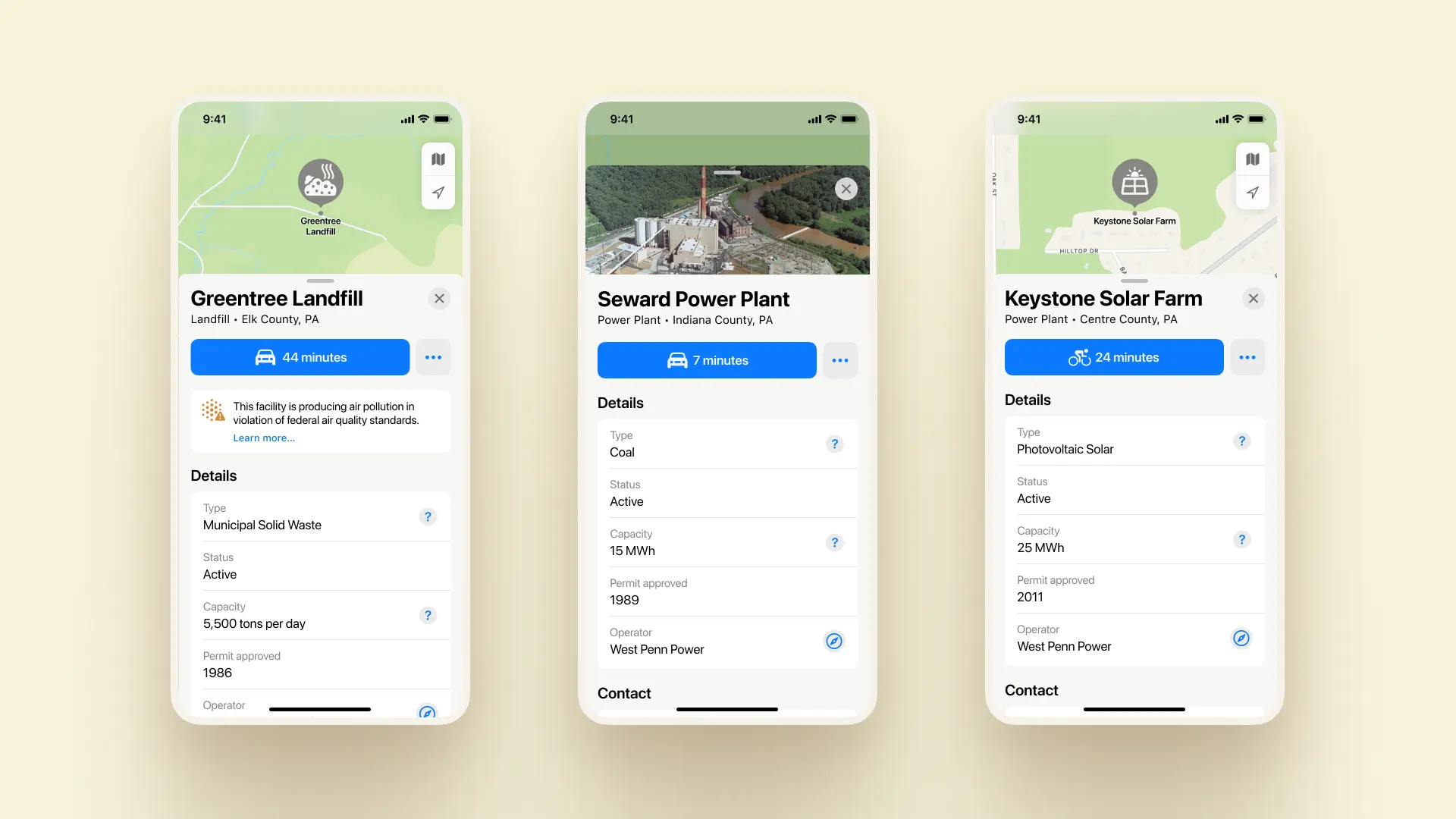
Instead of searching for a facility in an arcane government database, it could show a simple warning message, like for highway construction or a train delay: “This facility is producing air pollution in violation of federal air quality standards.” Sure, have a link that explains more, but not everybody needs to know about VOCs and xylene, but everybody does need to know about a hazard to their health down the street, and who owns it.
Beyond the search results, the cartography itself does you a disservice. Looking at this map area, we see roads, pristine greenness, small bodies of water dotted around. What’s the beige area?
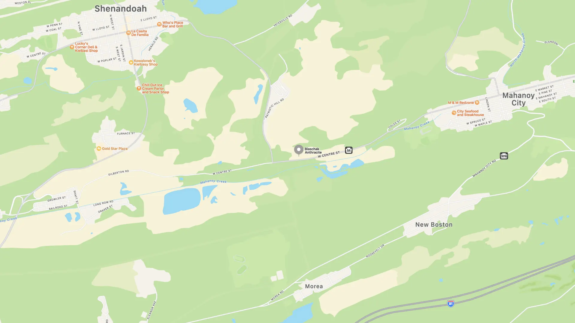
Those are coal mines! Every one of them. You would have no idea unless you switched over to the satellite view and know what they look like. The coal mine pin in the middle doesn’t show up on the map unless you search for its specific name. The emptiness of the map deceivingly indicates the area is barely inhabited, or unindustrialized; the opposite is true. This mine has been active for nearly a century3, producing half a million tons of coal per year. The quaint-looking ponds are mine drainage.
These mines are the lifeblood of the community, the major employers. You cannot describe the towns without mentioning the past and present of coal mining. The mines should be marked on the map. When you tap one, it should provide basic information about what’s mined, who owns it, how big it is.
With the headquarters of both Google and Apple in Silicon Valley, new features on their maps apps roll out to the Bay Area first. But looking at their constantly-updated, gleaming maps apps, you’d have no idea their county—a post-industrial landscape, following the earlier iteration of the industry’s midcentury semiconductor manufacturing—has the most Superfund sites in the country. Because the companies leave those sites unmarked, in favor of the roads and businesses on top today.
I struggle to grasp how intimately connected work in prior eras was to its land. Extracting, processing, moving, cultivating, burning, disposing, were all tied to physical land area and left evidence there. While there have long been exceptions (academia, banking, politics, etc), a majority of livelihoods have historically relied on their land underfoot. Growing up as a digital citizen whose identity was tied to a cultural scene on the internet more than any place I’ve ever lived, the particulars of the land nearby beyond its safety are more a perk than a necessity.4 Maps starkly built my understanding of all the landscapes I didn’t grow up in.
With their few natural hues to graph every square foot of the planet, our maps shape how we view the world, with indelible optimism. Maps contribute to the view I grew up with, that even though we’ve polluted areas, much of the Earth is pristine wilderness.5 Layering in more ways we’ve interacted with the land need not make them maps of our sins; the pristine maps a small-scale hunter-gatherer society could leave behind omits the tragic health outcomes never building proper shelter renders on a population. We’re not aiming for a society that never utilizes environmental resources. But we could afford, at this point in environmental history, to be realistic about how we interact with the planet we live on. To provide an onramp to understanding “what’s here?” in your own community without an environmental studies degree. Willfully ignoring on our maps every industrial site as not in consumer’s interests prevents us from developing a holistic understanding of our communities, our landscapes. The limited viewpoint of our maps makes us believe that’s all there is in the world.
If you look up the sites of the worst environmental disasters in American history on maps, they look like towns anywhere else: roads, businesses, natural features. There’s no pin on the map at Love Canal indicating the sly greenery lives atop a toxic dumpsite that used to house an elementary school that inspired the establishment of the Superfund cleanup program. When you’re driving from Pennsylvania to New York City, you pass through Kearny, NJ, home not just to logistics warehouses and a highway but last century’s mob-run toxic dump sites. On the maps, you’d have no idea. They offer a profoundly incomplete answer to the question, “what’s here?”
If you’re looking at a house on Zillow, the map shows you stores & businesses nearby, but it leaves out the answers to questions few would think to ask, and finding the answers to is too difficult. How close is the nearest fracking, and do we share water? Is there a pipeline/compressor station nearby polluting the air with flammable VOCs? Are there Superfund sites nearby? The answers to those questions, in some states, are available online, but you need to seek them out, find the web tools that show each one of these structures, and have domain knowledge 99% of people don’t have. Our mainstream digital maps do us a disservice by not answering these questions.
The support systems that enable modern capitalism—not only the roads, but the power plants and landfills and mines that enable our material economy—should live alongside the crown jewels of our capitalism on maps.
Footnotes
-
A quick aside on technical access to the map, with the context that I have a gigabit internet plan with high-end Wi-Fi equipment and one of the fastest laptops available. Opening the page requires downloading 30 MB, which for me takes 10 seconds, plus another 9 seconds of rendering time. Turning on all the layers totals 209 MB, taking 1.3 minutes, before doing any, more data-intensive, exploring. It’s not difficult to use over half a gigabyte of data, loading for much of 10 minutes, and have your browser run out of memory. Plenty of rural Pennsylvania only has access to DSL internet and older computers, where this map would be unusable. ↩
-
There used to be a more citizen-oriented version of this map, provided nationally from the EPA, called TOXMAP. Unfortunately, it was deprecated under the Trump administration in 2019; I never saw it. ↩
-
I acquired coal from this mine, for another art project. How much does coal cost, with its true costs all externalized? 19¢ per pound. ↩
-
I’ve never owned or leased property or buildings or space; I float from place to place under temporary agreements. Who lived on the land I grew up isn’t clear from examining the property on a map or in person; the energetic/material inputs/outputs came from elsewhere and went elsewhere. Little other than food in my home even came from anywhere nearby. ↩
-
Defining “pristine” at this point presents a challenge; with global atmospheric and oceanic chemistry changes reigning and few species left untouched, every ecosystem and landscape lives in its own state of damage or rehabilitation. But no matter how much exploitation and pollution of land we’ve done, life goes on—the planet remains swarming with flora and fauna in every corner, even if the mix has changed. The world may not be pristine, but in many regards, it remains thriving. ↩