Week 2 – New York Times visualization
In August, after President Biden signed the Inflation Reduction Act into law, the NYTimes made a visualization of the budget changes the law puts into place. It groups the changes into two categories: spending & tax cuts, then savings & new revenue. It uses what I would call a clustered bubble chart but is technically a “clustered force layout” to then visualize, to scale, the funding amounts in each category, with labels on all but the smallest circles. (In the digital version, the small circles can be hovered to view their label & funding change with a tooltip.) Across both types of spending changes, the circles are categorized with pastel background colors for taxes, energy & climate, & health care.
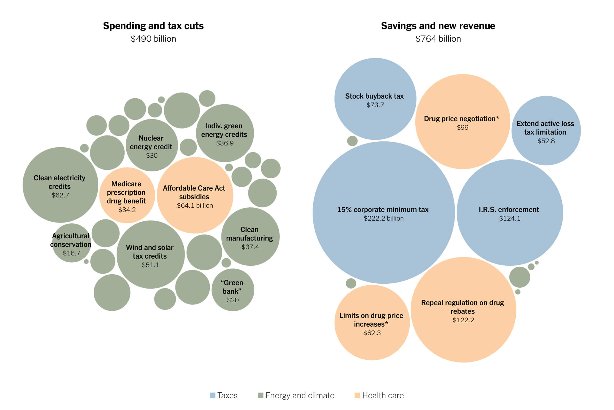
The neutral colors avoid applying judgement to the spend, which works well here: you can use the graphic as an “objective” source. (Objectivity never exists, especially in news & data visualization, but its editorializing is not immediately obvious). The balance of text & tooltips keeps the graphic readable, plus the truncating of the large-order-of-magnitude units down to single/double-digit dollar amounts for quicker mental comparison of numbers. What took me the longest to understand is the category names themselves; while I’m used to a concept like profit & loss, with the way the government makes money being the inverse of how I pay them (“tax cuts” has different implications for each of us), it takes a few seconds to parse what the categories mean for the budget, & whether they’re “good” (according to my values of big government).
Below the visualization, which lets viewers quickly understand the largest changes in a few seconds, there’s a table with every line item & the amount, for more careful comparison. This table is excellent, as the category dividers, clear rhythm, & easy-to-read typography make understanding the granular changes easy. The article follows, adding journalistic context to the visualization. Further down, a third table compares the changes across categories to Biden’s originally-proposed Build Back Better plan. This table feels the least attended-to, design-wise: subtle color coding or iconography would aid the comparison.
I’ve heard lots about the IRA being a big deal for climate, but this visualization puts it into super clear form. Looking at the spending half, all but two of the bubbles are green, corresponding to the energy/climate category. Simply color-coding these circles, without labeling each one & describing all the programs, says more to me than those actions would have, because I can parse this so rapidly. I’m grateful data journalists make visualizations like this, allowing me to not need to read every detail of these bills to briefly, but numerically, understand what’s going on with them.